This documentation provides a comprehensive set of guidelines for designing user interfaces (UI) to maintain consistency and cohesiveness across digital products and applications.
This comprehensive documentation outlines the fundamental principles and practices for designing a consistent and user-friendly User Interface (UI) across digital products and applications. It covers a wide range of topics, including design principles, color palettes, typography, layout, and interactive elements. The documentation emphasizes the importance of accessibility and responsiveness, ensuring usability across various devices and user needs.
It provides clear guidelines for UI elements such as buttons, forms, navigation, and error handling, along with recommendations for incorporating media and multimedia elements effectively. The documentation also addresses team collaboration, version control, and legal compliance.
By following these guidelines, teams can create cohesive and visually appealing UIs that enhance the user experience and maintain consistency throughout their digital products. Regular updates and adherence to best practices ensure that the UI remains relevant and accessible to a wide range of users.
Creating UI (User Interface) guidelines documentation is crucial for maintaining consistency and a cohesive design across your digital products and applications. Below, I’ll outline the sections you might include in your UI guidelines documentation:
**1. Introduction**
– Briefly explain the purpose and importance of UI guidelines.
– Mention the scope, indicating which products or platforms these guidelines cover.
**2. Design Principles**
– Define overarching design principles that guide all UI decisions, such as clarity, consistency, and user-centeredness.
**3. Color Palette**
– Specify the color scheme to be used in the UI.
– Provide color codes (e.g., hex, RGB) and usage guidelines.
**4. Typography**
– Outline the typefaces (fonts) to be used for headings, body text, and other UI elements.
– Specify font sizes, line heights, and styles.
**5. Iconography**
– Describe the use of icons within the UI.
– Include guidelines on icon style, size, and when to use them.
Read about UX Design Style Guidelines
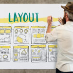
**6. Layout and Grid System**
– Explain the grid system used for layout, including columns and spacing.
– Provide examples of page layouts and component placements.
**7. Buttons and Interactive Elements**
– Define the style and behavior of buttons, links, and interactive elements.
– Specify hover effects, click states, and animations.
**8. Forms and Input Elements**
– Describe the design of forms, text fields, checkboxes, radio buttons, and other input elements.
– Include error message formatting and validation feedback.
**9. Navigation**
– Explain how navigation menus, breadcrumbs, and navigation bars should be designed.
– Provide guidance on responsive navigation for various screen sizes.
**10. Images and Media**
– Provide guidelines for incorporating images, videos, and multimedia elements.
– Specify image sizes, formats, and alignment.
**11. Accessibility**
– Detail accessibility guidelines to ensure that the UI is usable for individuals with disabilities.
– Comply with accessibility standards like WCAG.
**12. Mobile Responsiveness**
– Offer guidelines for optimizing the UI for mobile devices, including responsive design principles.
**13. Interactive Components**
– Explain the design and behavior of interactive UI components like sliders, tabs, and accordions.
**14. Error Handling**
– Describe how to handle errors, alerts, and notifications within the UI.
**15. Content Guidelines**
– Provide instructions on content placement, formatting, and tone of voice.
**16. User Flows**
– Illustrate common user flows and user journey maps for reference.
**17. Testing and Quality Assurance**
– Outline procedures for testing the UI against the guidelines.
– Specify tools and techniques for quality assurance.
**18. Version Control**
– Establish version control for the UI guidelines to track changes and updates.
**19. Team Collaboration**
– Encourage collaboration among designers, developers, and content creators in adhering to the guidelines.
**20. Documentation Format**
– Specify the format for storing and accessing the UI guidelines, such as a digital document, a dedicated website, or a design system tool.
**21. Training and Onboarding**
– Develop training materials to help team members understand and implement the guidelines effectively.
**22. Maintenance and Updates**
– Set up a schedule for reviewing and updating the UI guidelines to stay current with design trends and technology.
**23. Legal and Compliance**
– Ensure that the UI guidelines comply with relevant legal and privacy regulations.
Remember that your UI guidelines should evolve with your product and design needs. Regularly revisit and update them to stay aligned with changing user expectations and design practices.